Color is a very powerful tool in branding. When developing a color palette for your brand, remember that color has the ability to influence mood and tap into emotions. This is especially helpful when building our brand based on the emotion we want to evoke in our audience.
We are inherently programmed to respond to color. Extremely powerful in branding, it offers an instant method for recognition without having to use words.
In fact, color increases brand recognition by up to 80%.
Studies have also shown that color has the ability to affect not only our mood but our buying decisions. It can also increase our memory and so the ability for your audience to remember your brand. So in order to reap these benefits, it’s important to understand some color theory when developing a color palette for brand.
The Psychology of Color
RED is one of the most commonly used colors in branding. It’s an intense color that is used to get attention! Red has the ability to raise blood pressure and stimulate appetite. This is why many food brands use red for their branding. Red is often associated with passion, war, love, anger, danger, excitement and strength.  ORANGE, while not as strong as red, is still pretty intense. It can still be used to draw attention and also stimulates the appetite. It’s a good choice if you want to combine the features of red and yellow to create playfulness and stimulate emotions. Orange is often associated with affordability, creativity, enthusiasm, fun, high spirits and youthfulness.
  YELLOW just lights you up right away. It’s a color that’s regularly used for positivity, happiness and warmth. However, it’s a color that can be conflicting in message as it’s also used as a warning because of it’s ability to capture attention. Think traffic signs and traffic lights. Yellow is often associated with simplicity, innocence, peace, purity, caution and truthfulness.
  GREEN is the color of life! It represents renewal and growth and can be very soothing. However, green can also be associated with jealousy and inexperience. Lately though, it’s associated with brands that are striving to portray themselves as eco-friendly. Green is often associated with the environment, growth, nature, money, jealousy and harmony.
  BLUE has always been a calming color. It evokes feelings of stability and so lends itself well to brands that want to convey authority and security. Perhaps this is why it is most people’s favorite color and why it turns up so often in logo design. Blue is often associated with authority, power, confidence, loyalty, success, serenity and calm.
  PURPLE was usually the color of royalty. It is a mysterious color that imbibes both spirituality and sophistication. Because it is made up of both warm and cool colors, it can be found in both educational and luxury product logos. Purple is often associated with sophistication, mystery, nobility, royalty, spirituality and fantasy.
  PINK is a delicate color that is often called upon to convey femininity. It can also conjure up feelings of innocence and can be used in varying degrees to add feminine flare. Pink is often associated with romance, femininity, tranquility, gratitude, innocence and grace.
  BROWN is another neutral color that is deeply-rooted in nature. It can represent utility, simplicity and warmth. It’s richness and earthiness is perhaps why it’s so well suited to logos for construction and businesses that want to portray dependability like UPS. Brown is associated with neutrality, depth, earth, richness, subtlety, calm and nature.
  GRAY is a neutral color that is most often used the tagline in a logo as it goes well with most colors. It can be used as a warmer or cooler version of itself and each one feels slightly different. Gray is often associated with practicality, humility, respect, authority, corporate and dullness.
  BLACK is a menacing color that usually symbolizes evil. However, black can also be extremely sophisticated and luxurious. When used well, it can portray a brand and bold, sophisticated and powerful. Black is often associated with secrecy, mystery, formality, boldness, authority and tradition.
How to come up with a color palette for your brand
Now that you know you can use color to establish a mood or convey a message, how do you do it for your own brand? You have to tell your story with color and here are x tips on how to do just that.
1. Think about your audience
You must first know who your audience is before you know how you will design your brand. Tweet that! Who is your audience? Is your audience women? How old are they? If they’re younger women, are they the type that will like soft, pastel colors? Are they perhaps more into fashion and attracted to bolder hues? Are they older women, who like more subdued palettes? Age, industry, gender, all of these things and more will play into what attracts your audience. When you begin to design and start to develop a color palette for your brand, keep these things in mind. Decide once and for all who your audience is so you can benefit from that clarity and choose your color palette easily.
2. Learn to use color to tell your story
Luckily, we are not limited by the 10 colors listed above. We can make infinite amounts of color by mixing these colors together and by mixing them with black or white. When we add white or black to a color, we form what are called tints and shades, respectively. Tints and shades give us the ability to use a larger range of color within a palette. What does this mean? It means that you can choose to use 3 set colors for your brand and still get a broader range of color by using tints and shades to form your palette. By using tints and shades, we can also take a color that might otherwise be perceived as very feminine and tone it down to look more masculine. We can take a light color that looks more innocent and turn it into a more grown-up, sophisticated version of itself. 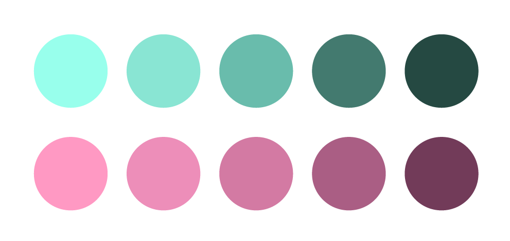 When trying to develop a color palette for your brand you must also be aware of color relationships. That is, what colors can do to each other. Take this example of the same aqua color placed next to different versions of yellow and green.
  What do those colors do to the aqua and the overall feel of the colors together? The mix on the right looks brighter and more fun, while the mix on the left looks more subdued.
In being aware of these relationships, you can bring in colors that are harmonious to your palette but that also add depth and mood.
As a general rule, I like to stick with 2 main colors + 1 accent color. Then I like to add a tint of one main color and shades of 2, sometimes all 3. That usually means I end up with 6-7 colors. There are always 3 main colors, but it’s good to have tints for subtle backgrounds and such and shades when I need a darker color. PRO TRICK: I always use slightly darker shades of my main colors when I do small text. Text that is smaller, tends to look much lighter and so is harder to read if you set it in your main colors. In these cases, I have slightly darker versions that, rather than looking darker, look as though they’re the same color. This compensates for the size issue nicely. If you need somewhere to start, have a look at Design Seeds or Adobe Color CC. These are both excellent sites for looking for color inspiration. Adobe Color CC is even great to experiment with your palette and save it on the spot. You can gather great ideas through sites like these. They expose you to color combinations that you might not think you’re attracted to.
3. Strive for balance
As in all things, balance is always your friend! It’s no different with color palettes. As you’re playing around with different colors and combinations, make sure you strike a balance. You can achieve this by working within one of 4 popular color schemes:
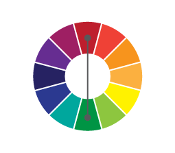
Complementary
This color scheme is made up of colors that are opposite to each other on the color wheel. This color scheme offers balance right away. It can also offer up tension as colors are opposite to each other and can produce tension. These do well as bold, energetic schemes.
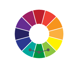
Analagous
This color scheme comprises colors that are next to each other on the color wheel. These color schemes tend to give off a feeling of serenity. This is because the colors are next to each other on the color wheel and are the most harmonious.
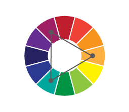
Triadic
This color scheme is made up of colors that are spaced evenly on the color wheel. This is probably the color scheme that offers balance the quickest.
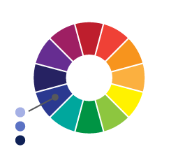
Monochromatic
This color scheme is derived from one single hue and accompanying shades and tints of the same. This is another color scheme that feels more calm and peaceful. Since you’re using one color, the scheme will be harmonious. Don’t forget that if you want to make it a little more energetic, you can throw in a complementary color in there. Make your choices intentional when you’re picking your two main colors. This way, your accent color will be easier to find within the color wheel. Also keep in mind that balance doesn’t necessarily mean your palette has to feel calm and serene. You can develop a bold palette that is still harmonious.
You shouldn’t really have 6 colors that all compete for attention. There should be a range within your own palette as well. You should have 2-3 accent colors for your brand but remember, you need lighter and darker tones to round out the palette. Don’t worry that there are too many colors. We choose these to accentuate the different materials you will need to brand. You will need background colors, colors for emphasis and simply a different color now and again. Remember, the goal is to build a versatile palette that will not only serve you to represent your brand but to distinguish it and make it memorable.
Good luck + Happy Branding!

