
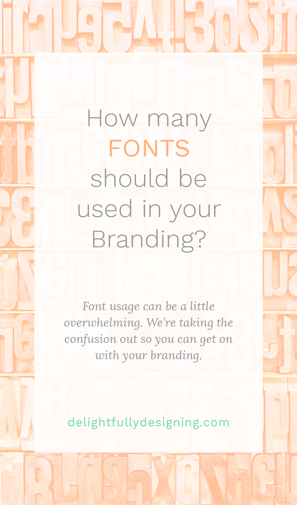
This question pops up in lots of my conversations. How many fonts should I use in my branding? Is 7 fonts too many? But I just LOVE Dancing Script, it’s so pretty, do I have to get rid of it?
So today, we’ll discuss, how many fonts you should use in your Branding!
While there are no steadfast rules for much of design, there are things that you should adhere to if you want your branding or any of your design to look professional. The problem many non-designers face is that in not knowing much about design they think that putting in #allthethings they can think of into a design is what’ll make it look good. In fact, it’s the exact opposite!
Think of the beautiful designs you’ve seen in the past. The ones you admire, the ones you pinned in your secret board. Go back and look at them, I’ll wait right here.
I’m willing to bet most of them are very simple. But I’m also willing to bet you didn’t notice they were. That’s where the magic is!
Distilling something into its essence is what makes good design.
It’s also quite difficult to accomplish. But when it’s done right, you can tell. You don’t have to be a designer to recognize good design, that’s why it’s good!
The same goes for branding and for font usage. You don’t need 5 fonts to use all over your brand, you need to stick to what works and what elevates your brand. In this video I talk about this exactly and I show you how I use 2 fonts to brand 2 of my clients. You’ll see how you can create depth in your branding without having to resort to more than 2 fonts.
There are not only many different fonts to choose from, but fonts themselves have styles to choose from. This gives you an opportunity to use less to create more!
So if you’d like to see how these options work, have a look at the video and then let me know your thoughts in the comments below!

