
When branding your business and/or blog, one of the most exciting and possibly confusing tasks is font pairing. If not done well, it can create the opposite effect of a well thought out brand. In creating your blog graphics, one of the most important aspects of the composition is font choice. This process consists not only of picking fonts that will represent your brand successfully but choosing fonts that look good together as well.
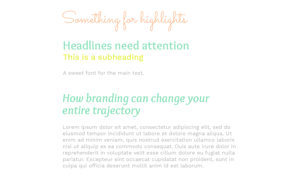
When you’re thinking of branding your business, in most cases, you want to stick to two main fonts and perhaps a complementary third for highlighting.
Remember, fonts that go well together are appealing to the eye and help your message come across in a positive way. On the other hand when fonts clash, oftentimes, it won’t matter what the message says, it will just look off putting and the graphic will not be successful.
In order to get your message across well, you must know how to handle font pairing. But what is font pairing and how can you do it successfully? You can learn about it by continuing to read below or you might want to take a shortcut and get yourself my Font Pairing Guide, which offers you learning AND a shortcut to my favorite font pairings.
Font Pairing
Font pairing is the creative technique of putting fonts together harmoniously, in a way that pleases the eye and matches the intended message. Font pairing is not only the way fonts work together but also how these fonts complement the copy.
In order to help you create better graphics for your blog and social media, and also to aid you in your branding journey, I will review some basic DOs and DON’Ts of font pairing.
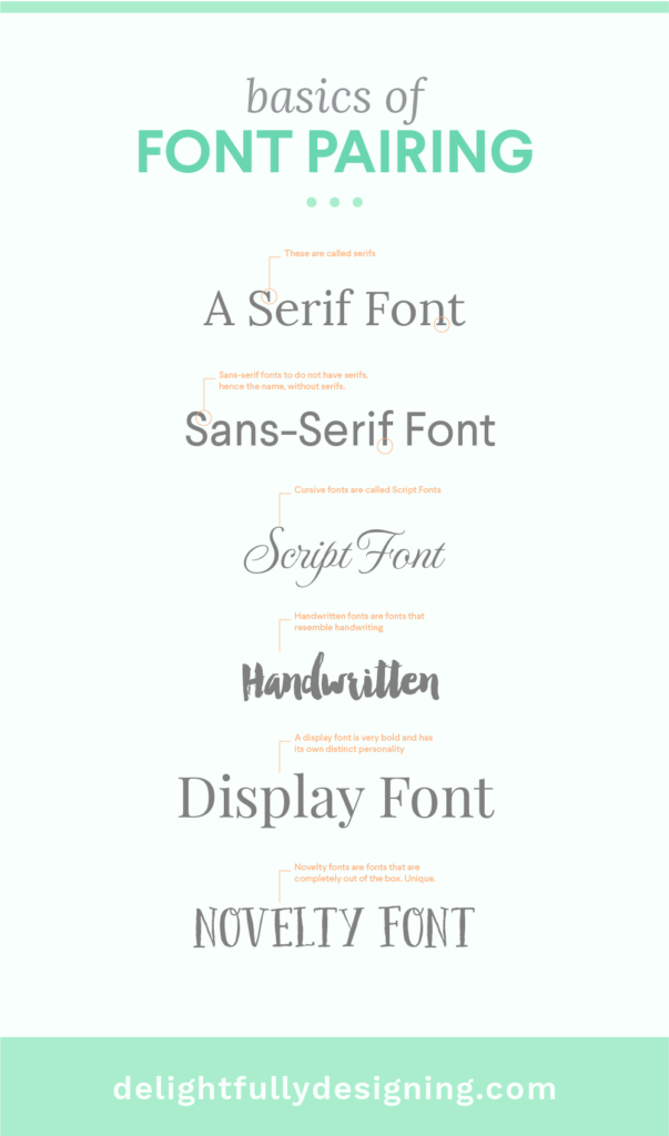
First let’s review the most basic and well known kinds of fonts. If you’d like to know more about various other fonts you can read about them on the bonfx blog.
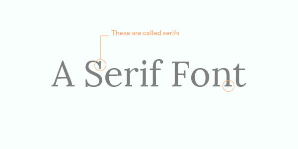 Serif – A font with dashes embellishing the edges of the letters
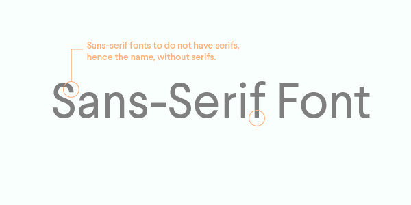 Sans Serif – A font without the previously mentioned embellisments
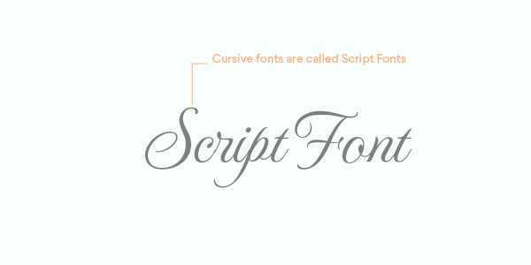 Script – A cursive font
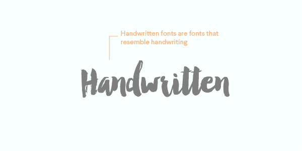 Handwritten – A font that resembles handwriting
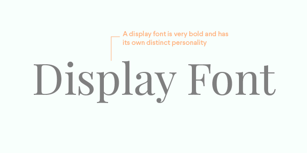 Display – A very bold and different looking font that has its own personality
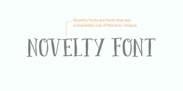 Novelty – Fonts that go completely out of the box!
Basic DOs in Font Pairing
1. The same font in different styles, weights & sizes
The easiest and best use of font pairing is to use the same font in its different styles. Classic fonts can be used in Bold or Italic, some more complex fonts have Condensed and Italic Condensed versions and even Bold Condensed Italics. Some fonts even have a serif and a sans serif versions, but that is pretty uncommon. Play around with one font first, it might be all you need for that graphic!
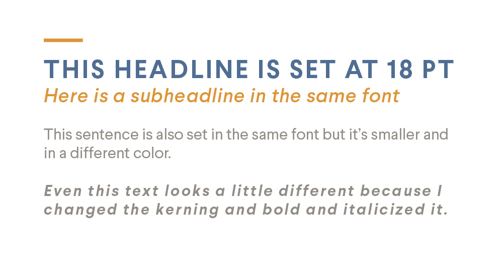 Another idea to try is classic font pairings with the same font in different weights. For example, normal and bold, normal and italics, bold and italics. You can also try larger and smaller fonts in the same style.
Related: How to use Google Fonts for your site + designs
2. Bold and script
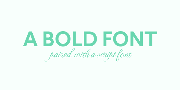
When looking for a distinct difference in fonts, a good match is a bold font with a script font (just not a bold script). Try different combinations of bold and script fonts to see which ones fit nicely. It’s best if one of them stands out more than the other so they are not competing for attention. Try making one of the fonts proportionally larger than the other.
3. Novelty or Display with a sans serif
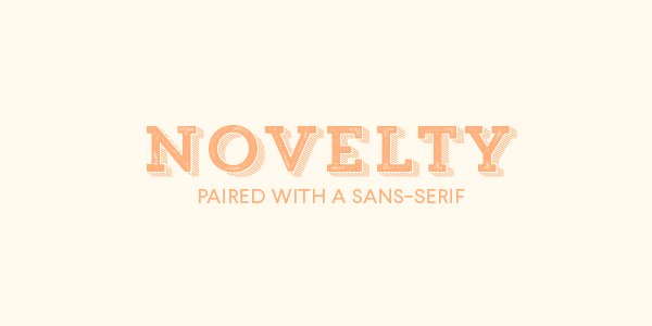
Novelty and display fonts have so much personality that a sans serif is pretty much your best bet for a good pairing. Although sans serif display or novelty could potentially go well with a simple serif font as well. The key to this kind of pairing is balance! Do the fonts looks like they could be a great match, could they be dance partners? Yes, getting creative with imagining your fonts having a relationship helps a lot. The app Type Connection will do just that kind of imagining for you!
Now on to some basic pairings to watch out for.
Definite DON’Ts in Font Pairing
1. Two scripts or handwritten fonts together
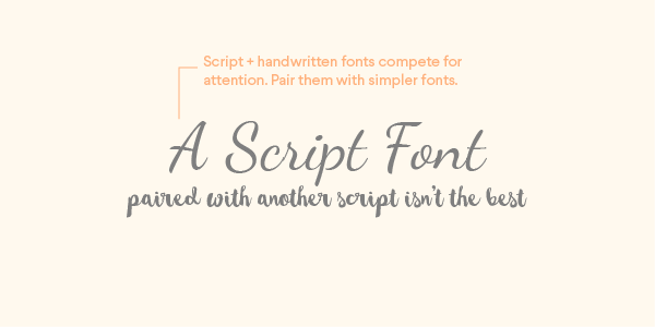
Scripts and handwritten fonts are all the rave right now, but you really should be careful how you use them. Some handwritten script fonts are really difficult to read. Some have letters that are badly shaped and look like something else entirely. Script and Handwritten fonts, like novelty and display fonts have very strong personalities, it’s almost like they don’t want to share the stage.
Imagine a script or handwritten font like a prima ballerina, she has the stage and if she shares it with anyone it will be with either a single strong figure or a group of other dancers that are not as important as she is. Keep scripts and handwritten fonts either on their own or paired with a different kind of font.
2. Two fonts that are too similar to each other
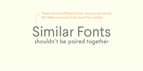
A huge mistake in font pairing is thinking that two similar fonts will fit together, just because they are similar. This is not true. Pairing similar fonts is one of the most difficult kinds of pairings to get right. Too similar and you won’t see the difference, too different and the thing will look wonky like something is off but you can’t tell what it is. The best thing to do is to avoid pairing similar fonts altogether.
3. Two display or novelty fonts together
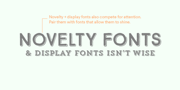
Using two extremely powerful fonts together is also a big no-no. It will be extremely difficult to differentiate who has the most power and so it makes it difficult to understand what part of your message has the most importance. They will probably clash and create a jarring effect. As I said before, display and novelty fonts go well either alone or paired with a simple font that won’t take away the limelight. They’re especially helpful in highlighting an important piece of text.
For more visual candy about good and bad font pairings, check out this slideshare from Utter Web.
Always make sure you pick a font that fits your message!
An easier way to work with Fonts
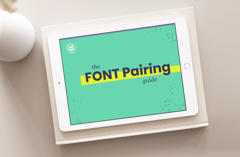
Now that you’ve gotten a really good idea of what font pairing entails, you might be thinking, I still don’t want to think about fonts, they make me crazy. I hear you! That’s why I created the Font Pairing Guide, a 87 page interactive PDF that will help you find font pairings in 10 minutes flat!
In it, I’ve organized font pairings by industry and emotion to make it easier for you to pop in your needs and get font pairings that you know will work. Check out the Font Pairing Guide.
This guide is so good, I use it myself on client projects regularly! Click the link to see a video walk thru of how the guide works!

