
Why use Google Fonts?
Before we talk about how to use Google Fonts, let’s talk about why you should even use Google Fonts.
A while back when the web wasn’t as awesome as it is today, designers were limited to the not-so-pretty standard fonts found in most computers. It was pretty frustrating to design this way. Not only were the fonts not so great but there weren’t many of them either.
When CSS3 came along, a few solutions started to spring up. First was the @font-face solution. This was a way to serve up fonts to a web page. Unfortunately, because of font licensing, embedding fonts into a web page wasn’t a great solution.
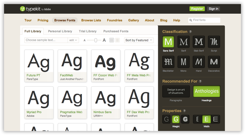
Then it got exciting! @font-face web font services started popping up. The most popular and my favorite was TypeKit. For an annual price, you could choose fonts to serve on your website. This made certain sites stand out because they weren’t using the same boring fonts you found across the web.
TypeKit worked wonderfully. You went in, picked a couple of fonts, grabbed their code and served the fonts on your site. For a typographical nerd like me, it was actually fun to browse through all the font styles. The only downside to TypeKit was the cost. For one site, it wasn’t too bad but if you had more than one site it was cost prohibitive. Spending more than $100 a year on just fonts was something you really had to think about if you were on a budget.
So along came Google and took a paid service and made it free.
TypeKit still has nicer fonts and a wider variety, but you can’t beat free when you’re on a budget. With time, the Google Font library has also grown. Now it’s even harder to justify paying for TypeKit when Google has done such a great job.
How to use Google Fonts
So let’s have a look at how to use Google Fonts on your website.
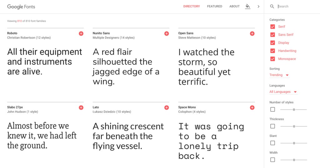
The Google Fonts site has been redesigned and it’s quite pleasant to work with. They even set up a button to change the background color of the page allowing you to get an idea of the fonts in different backgrounds. At least, that’s why I think they did it but it’s also just pretty. 🙂
When you first go into the site, you’re met with a selection of fonts. They are usually sorted by what’s trending.
Sorting Fonts
As you can see, you’re able to look through the fonts by categories. You’re also able to sort them by trending fonts, most popular, date added or just go alphabetically. There’s also sorting by the number of styles, thickness, the degree of slant and the width of the font. These are quite handy when you sort of know what you’re looking for but want to get ideas.
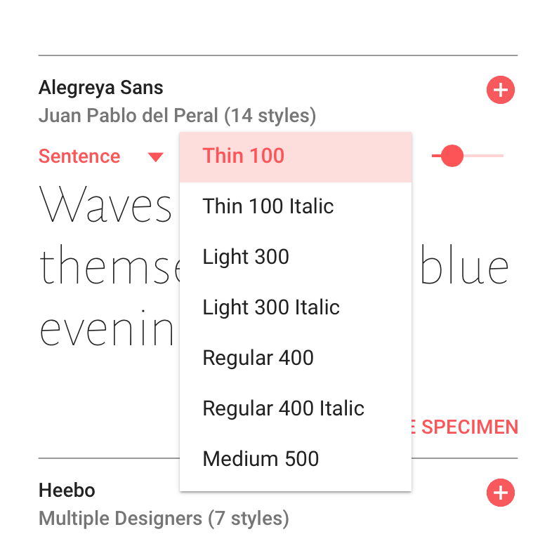
When you hover over a font, you also have the chance to see it used in a sentence or paragraph. You can also request to see the alphabet for the font or write in your own custom text. You’re also able to see the different styles the font comes in like Thin, Light, Regular, Bold, etc.
Selecting Font Families
Once you’ve played around with all the great options for selecting a font, you’ll likely pick two families. It’s always best to stick to 2 font families for your website and perhaps 1 display font, to use for emphasis. When you narrow down the two that you want, hit the plus sign and add these to your current selection.
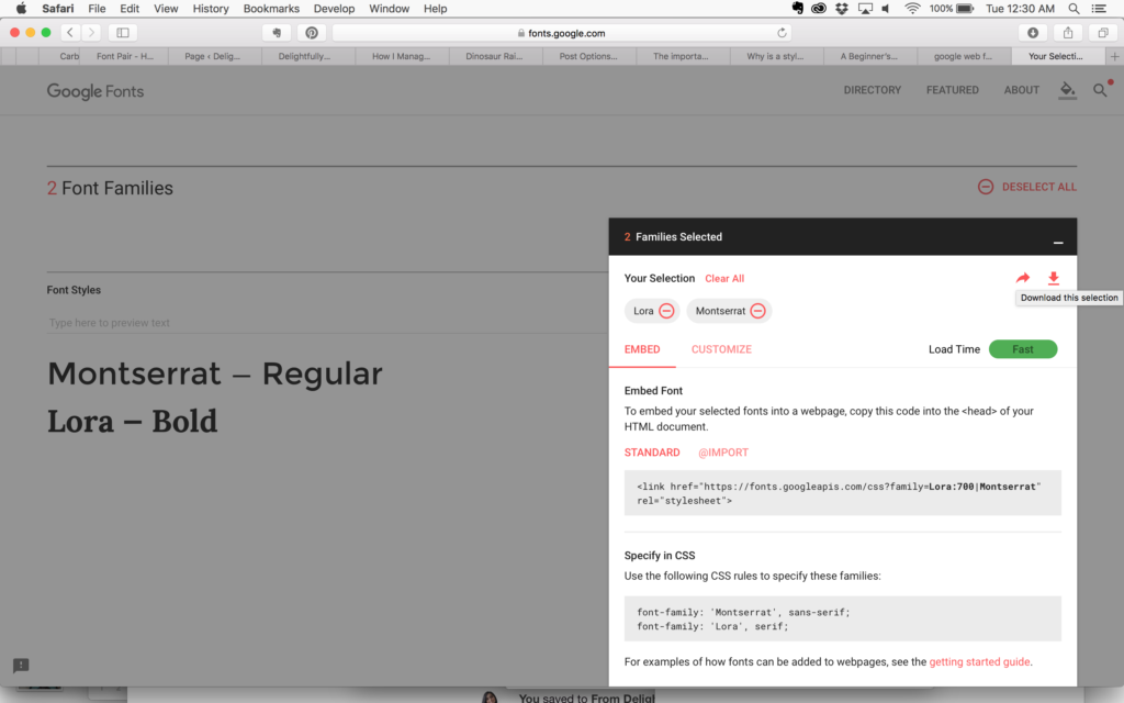
With the fonts in your selection, Google Fonts gives you instructions on how to embed them into your site. If you choose more than one at a time, the link will contain instructions for both at the same time. If you choose one at a time, then you’ll need two links. It’s always better to use one link for both as it speeds up the download.
Placing the font code on your site
Google gives you great instructions and examples on how to embed the fonts on your site. However, there’s a little more involved when you’re on WordPress.
Since WordPress builds pages dynamically, you can’t just put the code that Google generates for you on the home page. If you did this, it would only load your fonts on the home page. Instead, we must tell WordPress that this code should be on the head section of all the pages on your site.
To do this, we can use a very handy plugin I found recently called Head and Footer Scripts Inserter. Now, why use this plugin instead of one that directly inserts google fonts into your site? The only reason I prefer to use this is because I like to keep the number of plugins I use to a minimum. I already use this plugin to insert scripts from Google Analytics and LeadPages. So for me, it makes sense to use it to add other scripts when needed.
If you prefer, there are plugins that are specifically for adding Google Fonts into your WordPress site as well.
Using the Fonts in your site
So once you’ve gotten this code into your site, it’s time to designate selectors in your CSS. A selector is a piece of code that tells your website, “when you see this name, print it with these styles”. So basically, we’re giving the site instructions to use the Google Font families you just uploaded.
Here’s how you get that done.
First, decide where you want to use your fonts.
By this I mean, decide what fonts you want for headings and what font you’d like to stick with for body text. Then decide what will be bold or italic and the different sizes you want to use. For example, say you want to use Montserrat for your H2 headings. You’re going to write a selector in your CSS stylesheet that tells your site to use it whenever there is an h2 tag, which looks like this <h2>.
Then write these instructions into your stylesheet.
For example, I used Overlock for the overlay on my home page. So I made a selector in my CSS stylesheet that gives my site instructions on how to print (by print that just means show) that style on the site.
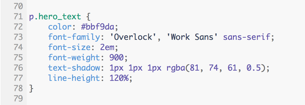
This text is a categorized as a paragraph text and uses a p to identify it. I gave the text on the home page a class name of hero_text. So the selector is referenced in the stylesheet as p.hero_text or .hero_text p, either will work. Then we can set things like the color, the size, weight and other effects you might want and, of course, the font family. So you can see in the image above, that I set the font family to Overlock. I also gave it a fall back of Work Sans and then sans-serif. This just means that if Overlock can’t load, it should try to load Work Sans next. If that fails as well, a sans-serif font should be loaded as a last resort.
The styles above are the ones that I used for the text on my home page. This is how these styles will look:

Fonts + HTML tags
So we have the selector in the style sheet. How do we now define which text gets style this way? Glad you asked!
You have to include that class name in the html that you use for your text. Like this:

This is the exact piece of code that I inserted to print this sentence out. If you have a look at the HTML tags, I have a p tag, for the paragraph text, with a class name of hero_text. So that is why the stylesheet controls this text and gives it the features we defined.
NOTE: You might be wondering why the part that says DIY a brand you love is in a different color. I wanted that piece of text to stand out and so I surrounded it with a span tag. A span tag allows you to add specific styles to just the text that is inside the span tag. By placing that bit of text in the span tag and setting a different color, it changed the color of the text that’s inside it only.
Ideally, you will define all your styles in your stylesheet and then use them throughout your site by referencing the class names. Class names can be assigned to any html tag. These styles are specifically for text so you will likely use them with text tags like heading tags (H1, H2, H3, etc.) and paragraph tags ( <p> ).
Helpful Resources
So there you have it! A look at how to use Google Fonts on your website. To keep things consistent, use Google Fonts in other designs. When you select your font families, there is a button that allows you to download the fonts. They download as a zip that you can open and install on your computer. These can then be used in Illustrator, Photoshop or any other program you design in.
This way, you can move right from your print design to web and vice versa. It’s a good idea to design with Google Fonts if you know you’ll eventually go to web and want to keep on brand.
If you want some inspiration for pairing fonts, visit Font Pair, which I discovered this week. Font Pair shows you different Google Font pairings and sorts them by style for you. It’s a really great way to see how fonts look together.
You can also read up more about font pairing with Google Fonts in this helpful article by Madison Miles Media. You can also learn about the Best Google Fonts for WordPress and how to optimize them for your site in this article by WPCity.
Another great resource is this curated collection by Typewolf. In this collection, Jeremiah goes through what he considers the best Google Fonts. He has different specimens to see each font and tells you how many weights they come in as well as other details. You can download all 40 fonts in one big zip at the top or download each separately.
You know you’ll want to reference all this great info again, so download this checklist. You’ll be able to keep all this info handy the next time you want to insert a Google Font into your site. It’s not difficult and it gets easier with practice.
Happy Branding,


