
Logo design can be incredibly daunting, specially if you’re not a designer. Which is why I’m here to give you a few of my own logo design tips in hopes that it makes things a bit easier.
When I sit down to design for a brand, the first step is to get clear on that brand’s purpose and who they serve. This guides me in my research, which in turn makes it much easier to start gathering ideas for a logo. There are a few things I keep in mind while working and I made a quick video to help illustrate these points. Check it out!
If you’d rather read or just want to go more in depth with a few examples, read on. These are logo design tips taken from my own process in branding clients and my own projects.
1. Probably the most important of these steps, KEEP IT SIMPLE!
I cannot stress enough how important it is to not complicate your designs.
Simplicity goes a long way in communicating sophistication.
It is very tempting to keep adding more to a design; more colors, more elements, more fonts. Distilling a design into its essence can be difficult but it doesn’t have to be if you keep things simple from the beginning.
So resist the temptation to add more “stuff”, instead think to yourself: “How can I communicate my idea with the least amount of elements?” Really think about each part of your design. Could you use less color? Are you using too many fonts? Do you have too many extra elements that are crowding the actual name?
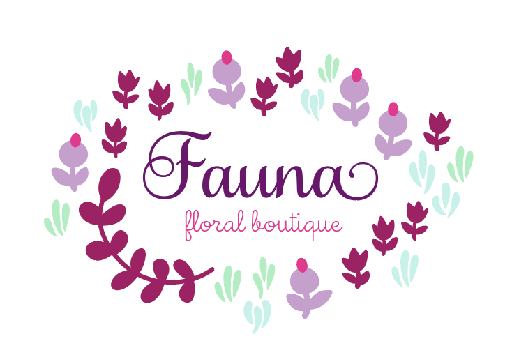
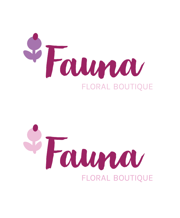
This logo above is a nice enough logo but it can definitely be simplified. At first you might think that simplifying it will make it dull and not special, but let’s see how simplifying it can actually make it stronger and more iconic.
Now, there are 6 colors all together in this logo. For branding, you want to stick to 2-3 colors. When you start, you should at least stick to a limited palette.
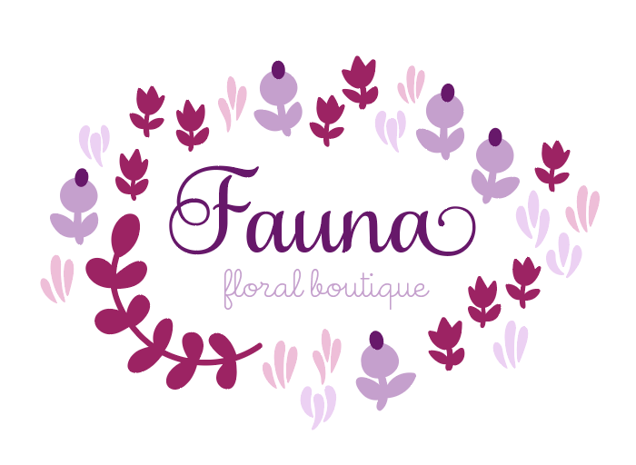
You can see a big difference once you start to limit the palette. There’s focus and purpose and it starts to look more like a logo because of it.
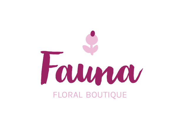
Of course, I’d continue to distill this design until we were able to communicate the essence of this company with the least amount of elements. I’d continue to dial down the colors and I’d certainly start to work on the amount of flowers that are included.
Ask yourself, will it work with less?
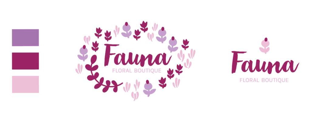
I believe it works very well with A LOT less. I took out yet another color. Then kept only one flower as a small representation that doesn’t detract from the name.
2. KEEP IT BALANCED
Balance can be tricky at times. There are many different ways to balance things. You can do it through color, or by resizing elements and of course, through placement. Below is an example of this logo in a different arrangement.
Although both of these samples are arranged the same way, the first image feels top heavy. You almost miss the FLORAL BOUTIQUE because it’s so light compared to the other two elements. In this case, an easy solution is to fix the imbalance through color. Lightening the flower will help balance the image. Doing this returns the focus to the center, where the name is.
Balance can also be achieved through placement.
Centering all the items while making the flower larger, keeps a natural balance between all the objects and establishes hierarchy in the design. By hierarchy, I mean the priority we give each element. In this arrangement, the flower becomes an icon, the name is prominent and the FLORAL BOUTIQUE is clear as a subheading or subtitle.
3. Finally, MAKE IT MEMORABLE.
There’s no doubt that the design is already much more memorable than when we started. That’s the beauty of simplicity, it does double duty. You can simplify your design and make it more memorable in the process.
Today more than ever, it’s important to make logos look iconic. For every website design, we are also tasked with designing a favicon and avatars and those need to be very simple. If you don’t know, a favicon is the tiny design that accompanies a url on the left side of the address bar.
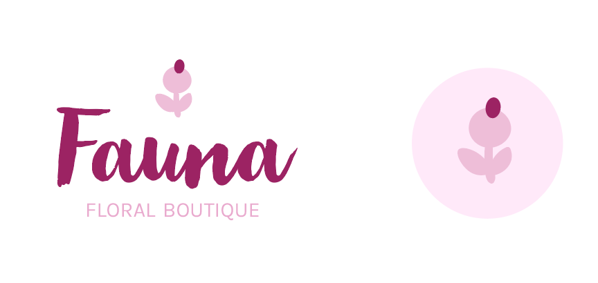
As you can see, the logo itself already looks way better than where we started. On the right, I’ve taken the small flower and designed a more iconic element to double up as an icon or favicon. These not only come in handy for the favicon itself but also for the profile image in any number of social media accounts. As the brand grows, it’ll be instantly recognizable and memorable.
So those are my quick logo design tips. I hope they help you out as you start to think about your own logo design. If you have any techniques you’d like to share, please tell us in the comments below.
Happy Branding,
